
Just Sync: turning couriers' street smarts into shared knowledge
A timeboxed design sprint for Just Eat Takeaway. I turned a vague "social hub" brief into something concrete: short notes about tricky delivery spots, where to park, the buzz code that works, which door to use, left by one courier and shown to the next who arrives there.
Role
Product Designer
WORK
Hi-fi prototype
Tools
Figma, Claude, Figjam
Timeline
3 hours
context
The brief asked for designing a "social hub" for couriers sharing their knowledge
This project was a 3-hour product design challenge based on a scenario from Just Eat Takeaway.
Couriers often work independently, making it difficult to exchange knowledge and support one another. The challenge was to design a Social Hub where couriers could share practical advice on topics such as taxes, deliveries, and everyday work experiences, while proposing an MVP roadmap that could be delivered within six weeks.
reframe
I narrowed the broad idea of a social hub into one testable problem.
Instead of designing a broad social hub, I reframed the challenge into one testable idea: location-based knowledge sharing.
The goal was to help couriers capture and access location-specific tips during deliveries, rather than creating another destination they needed to visit. By anchoring practical tips to specific pickup and drop-off locations, the concept became something that could be validated through an MVP planned for a six-week development cycle.
Research
Pickup and drop-off are where couriers struggle most
I conducted a 30-minute courier interview with a Montreal courier and audited Reddit discussions to understand where couriers experience the most friction.
Mapping the findings by delivery stage showed that recurring issues happen mainly during pickup and drop-off, while most en-route problems (GPS, weather, platform bugs) were outside the scope of product design.
pick up

Parking & restaurant friction
Hard-to-find parking, ticket risk, entrances that don't match the pin.
En route

Out of design's reach
GPS drift, app crashes, weather issues happen but cannot be solved by sharing notes or tips
drop-off

Location knowledge gaps
Missing buzz codes, confusing lobbies, incomplete addresses.
Social content audit

Opportunity
The same delivery problems happen repeatedly,
but the solutions are never shared.
Experienced couriers gradually learn where to park, which entrances to use, and how to access difficult buildings. However, this knowledge disappears at the end of each shift, forcing every new courier to solve the same problems again. This revealed an opportunity to help couriers capture useful knowledge and surface it when another courier arrives at the same location.
Insight 01
Scrolling constantly
Re-checking what was already filled.
Insight 02
Filling out of order
Jumping back and forth across the form.
Insight 03
Leaving the tool
Logging into advisor profiles just to check how it looked.
benchmark
Existing products showed how knowledge can be structured and encouraged
Instead of inventing new interaction patterns, I looked at products that already help people contribute information efficiently. Google Maps inspired structured note creation through categories and searchable content, while Yelp demonstrated how lightweight recognition can encourage participation without requiring a full social network.
Insight 01
Scrolling constantly
Re-checking what was already filled.
Insight 02
Filling out of order
Jumping back and forth across the form.
Insight 03
Leaving the tool
Logging into advisor profiles just to check how it looked.
solution
Design a lightweight, location-based knowledge sharing experience that fits naturally into couriers' existing workflow
Rather than building a standalone social platform, I designed Just Sync, a location-based note system integrated directly into the order screen. Couriers can quickly leave practical tips after completing a delivery, and future couriers automatically receive the most relevant notes when they arrive. The MVP intentionally excludes feeds, chat, followers, and gamification to validate one core assumption: Will couriers share useful knowledge while working?
Insight 01
Scrolling constantly
Re-checking what was already filled.
Insight 02
Filling out of order
Jumping back and forth across the form.
Insight 03
Leaving the tool
Logging into advisor profiles just to check how it looked.
SOLUTION
Organize by what admins decide, not by data schema
01
From a modal to a dedicated page
The single biggest structural change, everything else depended on having enough canvas.
02
Content left, configuration right
First decide what you're publishing, then who sees it and when.
03
Preview as a tab
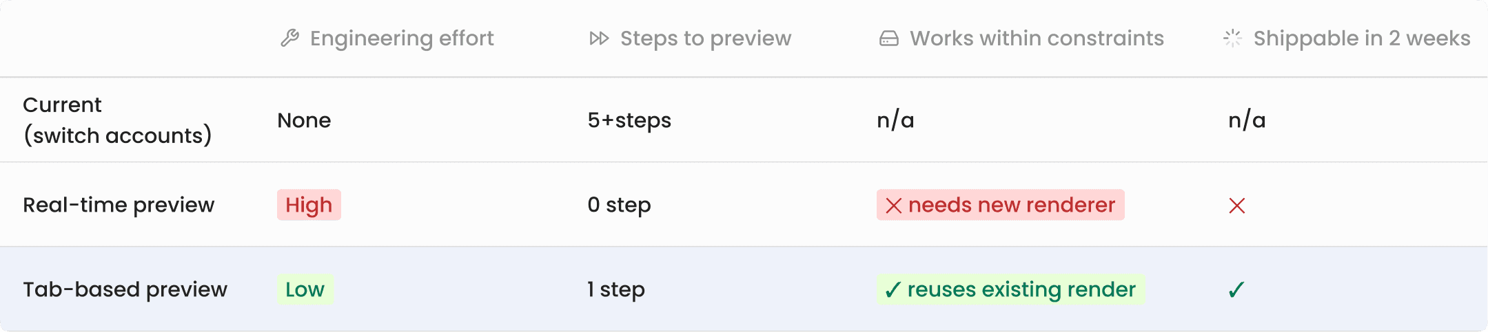
A real-time renderer would have been a significant engineering lift. The tab reuses the existing broker-side render.
From a modal to a dedicated page
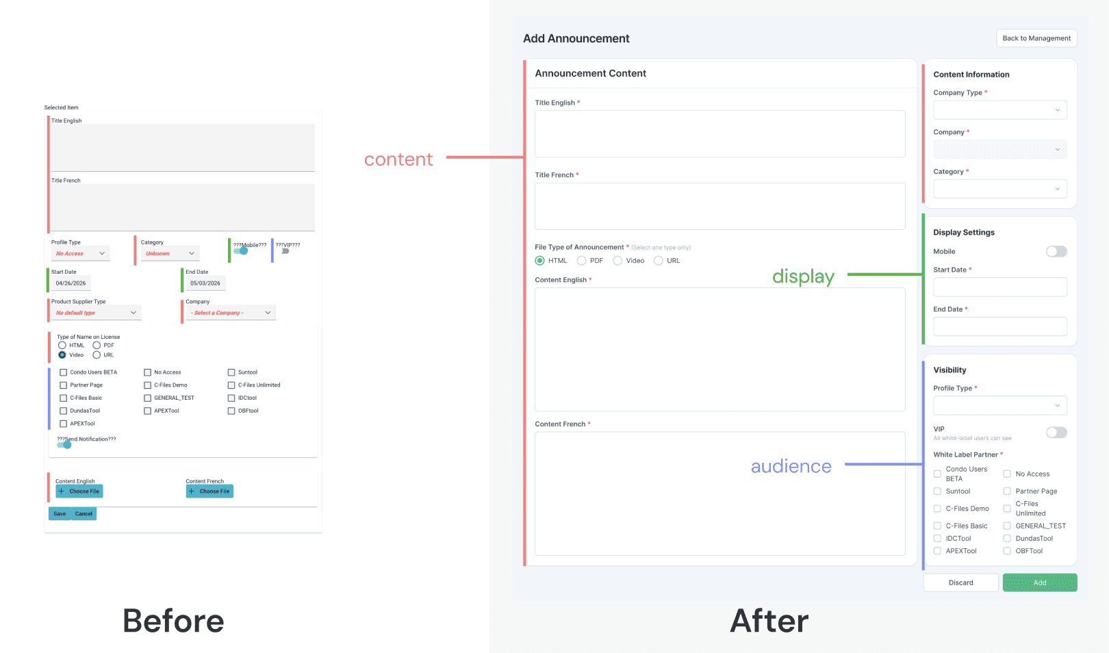
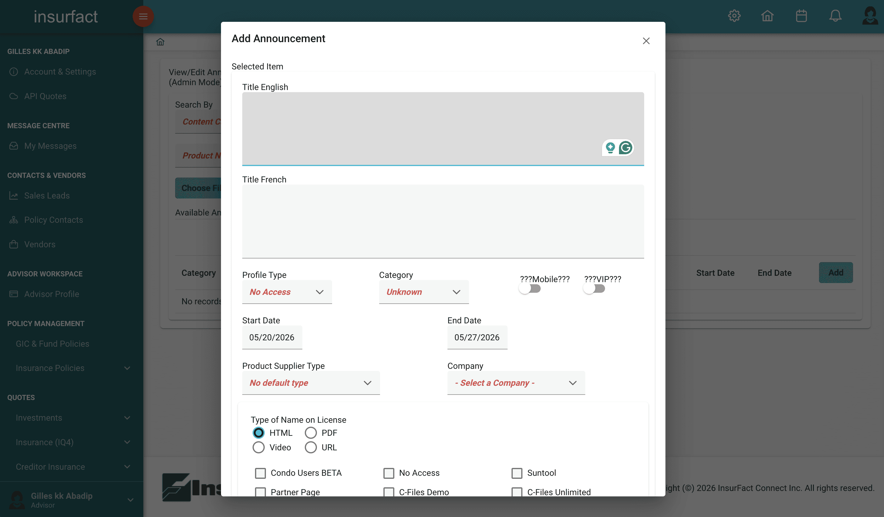
The original add/edit experience lived in a modal, which severely limited how much information could be surfaced clearly.
I moved it to a dedicated full page. This gave enough space to separate content from configuration, and made room for a proper preview experience.
Organize by what admins decide, not by data schema
The original form was structured around the database.
I reorganized it around the admin's decision-making process:
Content fields moved to the left.
Configuration, audience targeting, scheduling, distribution, moved to a right sidebar.
Admins no longer had to scan the entire form to find what they needed.
Add preview as a tab
Admins were spending time navigating to the broker-facing platform just to check how an announcement looked.
I proposed a tab-based preview that reuses the existing broker-side render.
Less engineering cost, same outcome for the admin.
tradeoff
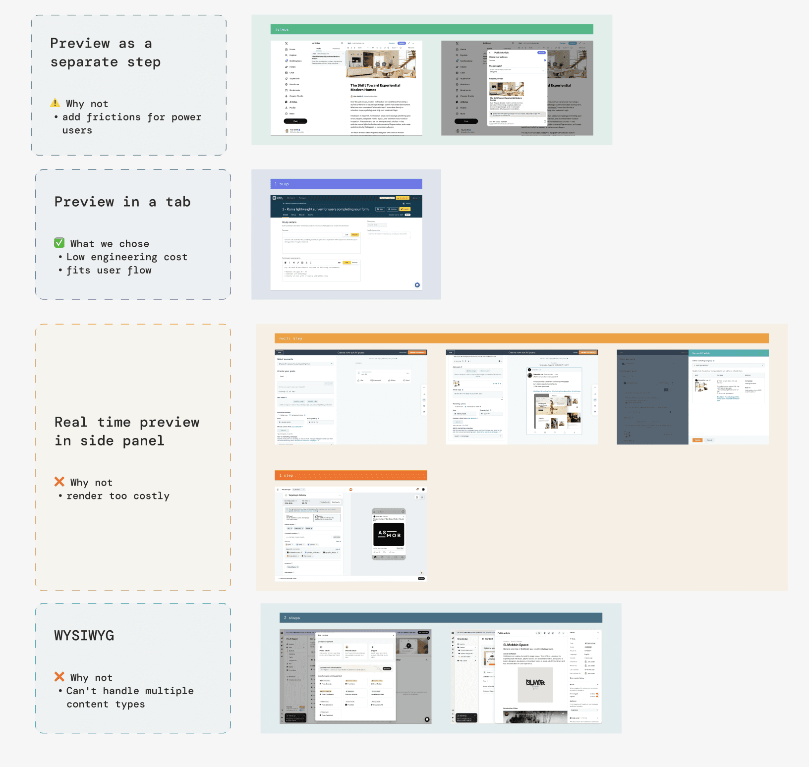
How to present preview?
Before proposing the preview solution, I reviewed four preview approaches used across content management tools by evaluating each against the constraints of this project.
SOLUTION
Submit-first preview
Real-time preview was the ideal. But given the no-backend-changes constraint and the two-week timeline, tab-based preview using the existing render was the right call. Same result for the admin, significantly lower cost to build.
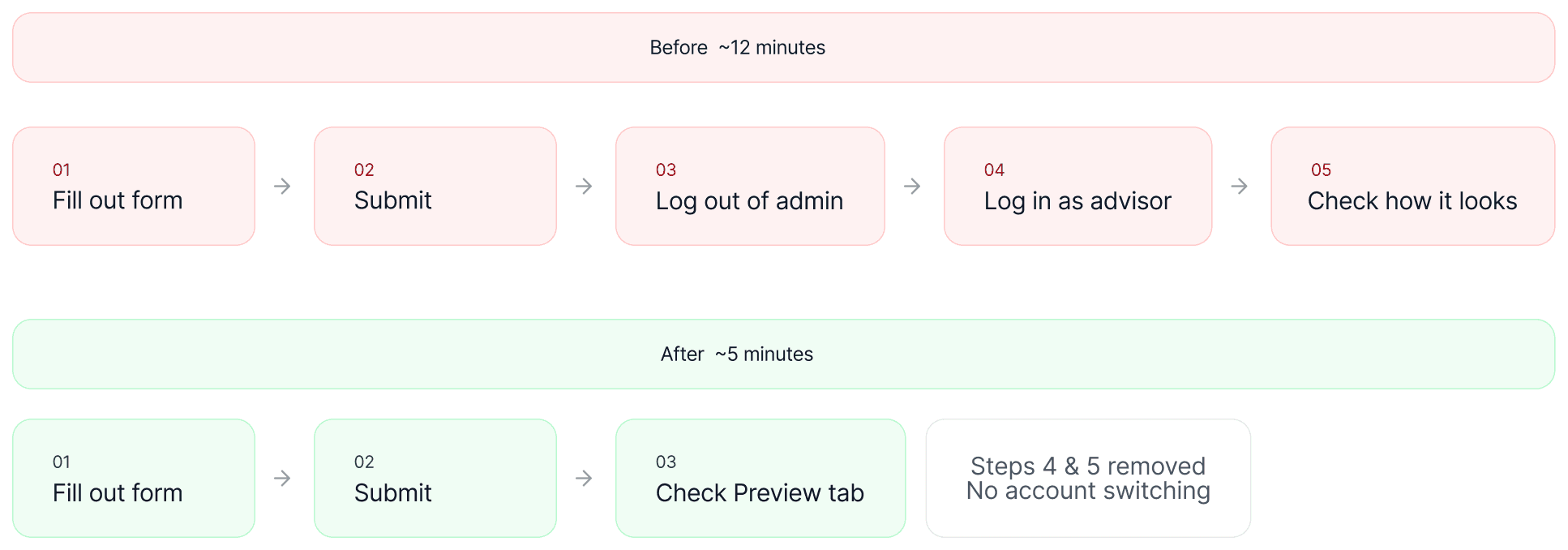
The real win is eliminating the account-switching detour.
Five steps across two sessions became one submit inside the same tool.
Known limitation: if something looks wrong in preview, they'll need to edit and resubmit.
Final Design
Before vs. After
Deliverables
Edge Cases & Interaction States
I built an interactive HTML specification to document every edge case and error state for an announcement management feature. This gives engineers a single reference they can interact with directly during implementation, reducing back-and-forth with design and eliminating ambiguity at handoff.
Impact
"I don't have to switch back and forth anymore.
I can just check it right there."
— Ops team admin
The biggest savings came from the preview tab: the finish–submit–check–return loop accounted for most of the extra time. Combined with the clearer structure, the average publish went from about 12 minutes to 5.
↓ 58%
TASK TIME
12 → 5 min
AVG PUBLISH TASK
2 weeks
design to ship